Look bitch. These are the facts: The bellini was born in Venice in 1948 at Harry’s Bar; Harry’s Bar has always been popular, and remains famous for having been frequented by famous people (Ernest Hemingway being among the most famous and the most frequent); the drink is basically just an Italian mimosa—the original recipe called for only peach purée and Prosecco; Giuseppe Cipriani—the founder and then-owner of the bar, and concoctor of the cocktail—named it after the great 15th century painter Giovanni Bellini.
“In creating what was to become known as the bellini cocktail in 1948, my father was…inspired by a painter,” Cipriani’s son, Arrigo, writes in Harry’s Bar: The Life and Times of the Legendary Venice Landmark. “The 15th century Venetian painter Giovanni Bellini was often mentioned at home. I had no idea at the time that the pink glow my father had so admired in one of Bellini’s paintings would be the inspiration for his famous cocktail…He experimented by pureeing small white peaches and adding some prosecco. Those who tested it gave it rave reviews…He named it the bellini, and from that day on the pink champagne drink became part of the Harry’s Bar culture.”
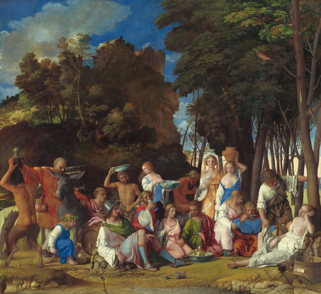
The exact work that inspired the drink—if there is indeed only one—is unknown. The exact work that got me Googling about the bellini cocktail, though, is this Bellini and Titian bacchanal, Feast of the Gods.

The palette of the painting isn’t particularly peachy or pink, but none of Bellini’s paintings are particularly peachy or pink. And anyway, it wasn’t the painting’s colors that got me wondering if the drink and the artist are related—I knew the bellini was a cocktail, but that was it. I knew nothing about its ingredients, or its color. All that struck me in the moment was that the painting I was looking at depicted a bunch of drunk fucks, and that it was painted by a dude whose last name is the same as the name of a drink that gets fucks drunk. I thought maybe this Bellini dude was a known party boy—à la Carravagio—and had the drink named after him in…honor?…or?…something?
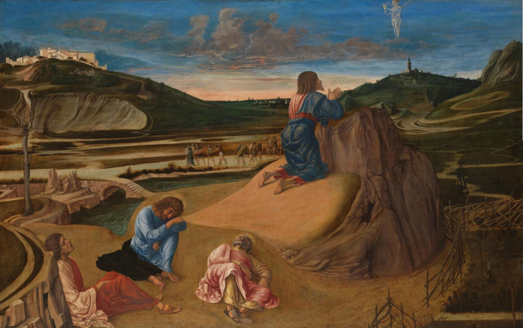
Alas, though, my presumption was wrong and the drink shares a name with the artist because the man who invented the thing liked the peachy pink palette of one of Bellini’s paintings. Which: okay. That makes enough sense. Bellini’s oeuvre isn’t—as we’ve discussed—particularly peachy or pink, but when the hues do appear, they’re memorable. They’re brilliant and luminescent in a way many other colors on his canvases aren’t. They feel less heavy—less grounded—and just kind of…pop, you know? Like here, in The Agony in the Garden.

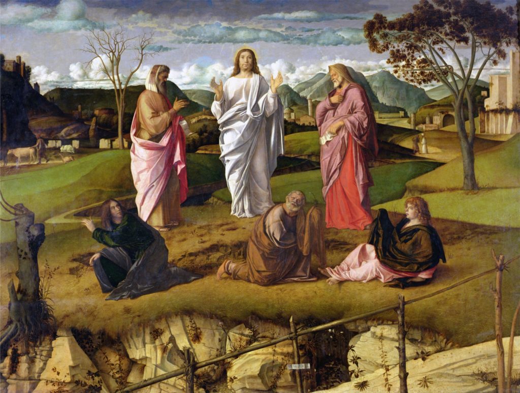
And here, in The Transfiguration of Christ.

Except for maybe his blues, which often share the same pizzaz as his pinks, the colors on Bellini’s canvases usually tend toward matte and muted and drab. But that’s exactly why his pinks (and blues) pop so much. Because one of the many things color is, is contextual. The way colors look is in very large part influenced by the other colors around them, and by the lighting conditions and sources under which they’re being viewed. Using matte and muted and drab colors—an earthy palette, if you will—practically guarantees that the less earthy colors will pop. And back in Bellini’s day, when paintings were viewed only by the light of the sun or a flame, how his pinks (and blues) must have popped and pizzazed. Even here through the screen—which is a whole different ballgame when it comes viewing art—there’s an element of motion to them; they seem, almost, to shimmer, or sparkle; to, as Arrigo Cipriani said, glow.
But I digest. This post isn’t an analysis of the palette of Bellini’s oeuvre, or an explainer on the effects on color perception of context and lighting conditions. It is, ostensibly, about how a basic bitch brunch beverage got its name. But it’s also, and more actually, part reportage (regurgitation, really) and part speculation about the intentionality of the materiality of the thing. SO LET’S CONTINUE.
Much has been said about the intentionality of Cipriani’s choice of peach purée for its parallel to the pink palette of a Bellini painting. But not much, if anything, has been said about his choice of Prosecco. Perhaps the Prosecco was simply preference, or convenience, or convention—Italy, wine, you know? But, counterpoint, maybe not! Maybe there’s some symbolic intentionality in Cipriani’s pick of Prosecco, too. Maybe—dot dot dot—the Prosecco was on purpose.
Hear me out. We know for certain the drink’s peach purée pays homage to the chroma of Bellini’s pinks. Perhaps the Prosecco, then, is meant to mimic the hue’s dimension and dynamism, the effervescence of Bellini’s pinks embodied by the bellini’s bubbles. Yay? Nay? Meh?
Can’t say for certain, but it doesn’t seem impossible! Could be coincidence. But me personally? I choose to believe it’s conspiracy. Either way, regardless of which fruit juice or purée you pair with a given sparkling wine, if you’re not ratio-ing it like this, you’re doing it wrong: